Here is a copy of our presentation online.
https://powerpoint.office.live.com/p/PowerPointView.aspx?FBsrc=https%3A%2F%2Fwww.facebook.com%2Fattachments%2Ffile_preview.php%3Fid%3D1091967587496210%26time%3D1426690893%26metadata&access_token=1268583927%3AAVJ3KlYCISkz-gzZUGYPUTnevRbkNTczjCNKxtTyBZLfig&title=exhibition+presentation+1.pptx
Wednesday, 18 March 2015
Sunday, 15 March 2015
Self Appraisal
Description of
study / practice undertaken: this enables you to identify the nature and
range of work undertaken, i.e. the methods, materials, strategies and workshops
used and the subject/content and context developed)
The
practice undertaken in the module Art and Exhibition was to plan and create an
exhibition. Within this module my working group and I were allowed to establish
our own exhibition according to the theme of our choice. We chose the artworks,
design layout, advertisement etc. The title of our exhibition was ‘Made you
look’. We chose this due to the subject matter of uncomfortableness, as we
wanted an exhibition which was interactive and interesting for the audience. Through
the use of uncomfortable subjects, such as body parts and rape we felt as
though our audience could relate in some way to their own phobias In life. Throughout the whole process of creating the
exhibition we had regular meetings to discuss certain topics, such as role
allocations in the group. We had to create advertising documentation, such as
leaflets, exhibition guise, posters, invitations and a press release.
Appraisal:
this enables you to objectively and
critically consider your achievements / or failure, and analyse the strengths
and weaknesses within your work or practice from this module.
The
group and I have successfully learnt how much planning, organization and time
goes into creating an exhibition. We feel that the majority of us were
organized throughout the exhibition, although a few members of the group were
not. Each member of the group stuck to their allocated roles and our negotiating
skills seemed to have progressed through out the module. The documentation in
my opinion was very successful as to me it look professionally done and I think
it was clear that a lot of thought and time went into each advisement. The
actually exhibition seemed to have gone better than expected. Our creativity
throughout the exhibition was clear as more than half of the artworks were
displayed in a different way of which the artist displayed them.
However
I do believe some members of the group did more than others and consequently
this could have affected the exhibition as it put more pressure on certain member
of the group, such as me to create lots of work in a short space of time. Although
the group met up frequently to discuss the exhibition, I think organization
could have been improved with the artists, as it was not clear to two of the artist
which pieces we were using. If I were to improve anything about the exhibition it
would be to move one of the pieces to the other side of the wall (as recommended
in the exhibition feedback) as I believed it would have worked better. However
due to problems with artist installing the work this wasn’t possible.
List of skills acquired / developed: in relation to the module learning outcomes, this
enables you to identify the acquisition of particular practical, technical and
intellectual skills.
After
experiencing this module, I believed I am more creative in my thinking of how
to display my own work. I have also been inspired by certain materials and
ideas artists use in their own work. My teamwork skills have most defiantly improved,
as although I take the leadership role on often, I feel as listening to other
peoples idea improve my own. During this module I have defiantly become more
aware of health and safety and things and can and can’t do either when making
work or displaying it.
Monday, 2 March 2015
Opening night
Personally, i thought the opening night was very successful, as not only was we happy with the outcome of our exhibition, but also the amount of people who turned up made the night extremely enjoyable. Seeing everyone appreciate the hard work we had done, was such a lovely feeling and defiantly made me think more into becoming a curator.
 Although we thought about getting a book or presenting a questionnaire for the audiences feedback on the exhibition, we decided that the most effective way to get feedback would be to talk to the audience. Therefore, the group and I discussed different questions to the audiences over wine and refreshments. This made the audiences experience a lot more enjoyable, rather then making them feel pressured to answer questions.
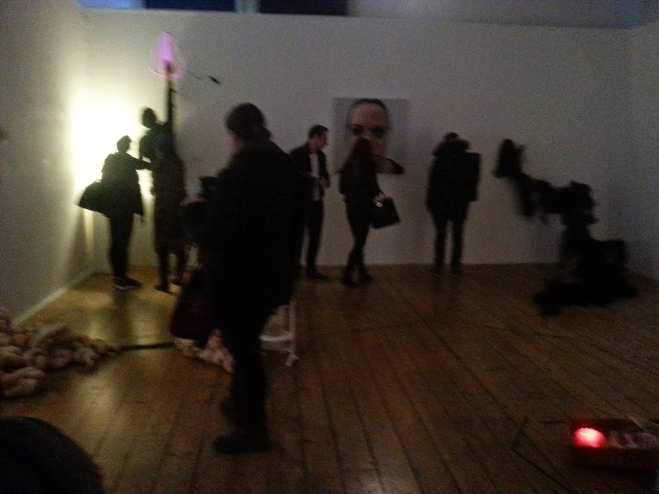 I spoke to John Wiggly who gave some great feedback on both what was good and how we could of improved the exhibition. He commented on how he loved that we had explored different ways of presenting the artists work and how he really couldn't fault one thing. However he did suggest that we could have moved the vaginal light (by Iiona Sikita) above the hair piece on the other side of the wall. I completely agreed with John after he explain the relation through the pubicness of the hair. However due to the artist having to spend half and hour installing the piece, it was not an option to keep trying the piece out in different locations around the room.
The feedback the rest of the group consisted of comments such as:
"It was definitely different viewing an exhibition in the dark"
"I felt like i wanted to turn it off because it was to upsetting to listen too"
"That projection thing was gross"
We were so happy with the feedback we got and the suggestions that were made on the opening night, as everything people mentioned was took into great consideration. Overall i was so pleased with the whole experience. Working with other people and listening to their ideas would have to be my favorite part of this module, as it has really made me think of ways in which i can display my own work. I've loved every minute of it creating my own exhibition and it has defiantly made me think about my future and whether or not i would be interested in becoming a curator.
 Although we thought about getting a book or presenting a questionnaire for the audiences feedback on the exhibition, we decided that the most effective way to get feedback would be to talk to the audience. Therefore, the group and I discussed different questions to the audiences over wine and refreshments. This made the audiences experience a lot more enjoyable, rather then making them feel pressured to answer questions.
 I spoke to John Wiggly who gave some great feedback on both what was good and how we could of improved the exhibition. He commented on how he loved that we had explored different ways of presenting the artists work and how he really couldn't fault one thing. However he did suggest that we could have moved the vaginal light (by Iiona Sikita) above the hair piece on the other side of the wall. I completely agreed with John after he explain the relation through the pubicness of the hair. However due to the artist having to spend half and hour installing the piece, it was not an option to keep trying the piece out in different locations around the room.
The feedback the rest of the group consisted of comments such as:
"It was definitely different viewing an exhibition in the dark"
"I felt like i wanted to turn it off because it was to upsetting to listen too"
"That projection thing was gross"
We were so happy with the feedback we got and the suggestions that were made on the opening night, as everything people mentioned was took into great consideration. Overall i was so pleased with the whole experience. Working with other people and listening to their ideas would have to be my favorite part of this module, as it has really made me think of ways in which i can display my own work. I've loved every minute of it creating my own exhibition and it has defiantly made me think about my future and whether or not i would be interested in becoming a curator.
Saturday, 28 February 2015
Final Floor plan
The final floor plan was put together after we had set up the exhibition. This is due to the fact that we did not want a finished floor plan until we had decided on where the art works were positioned best. Although the the final plan is very similar to the designs we had pre-made we feel as though we made the right decision to experiment, as curator, to deliver the best exhibition we could have possibly done. For us the floor plan was a struggle as we needed to make decisions such a were the wiring would go for the electrical pieces. Also for pieces such as the artists, Shelley, we used them to our advantage and created our own composition for the piece. For this reason we could not put them in the floor plan designs as we did not know what hey would be until we installed the exhibition.
Setting up the Exhibition
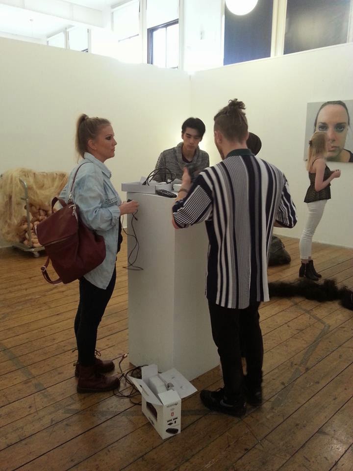
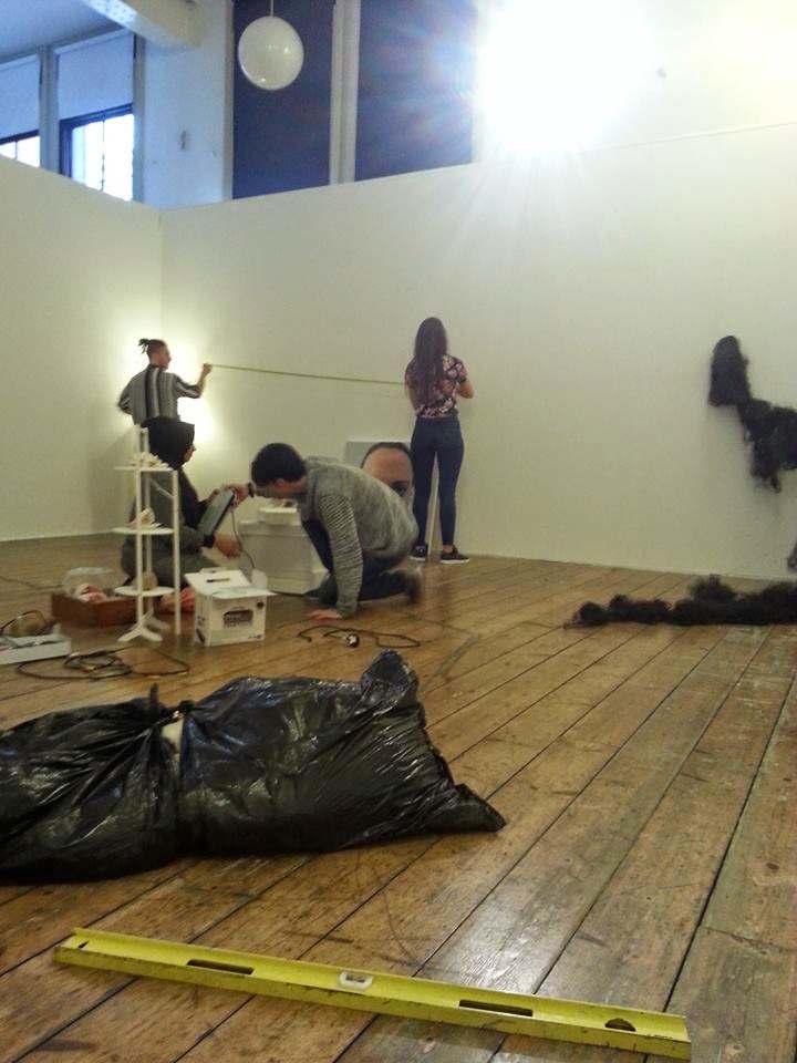 Setting up the exhibition was a long process of which took a lot of organization and last minute decisions. We had a plan of what would go up first and what would be left until last. For example the painting by Sam Percival would go up first as it only needed to be measured on straightly on the all. We decided it would go in the center of the back wall as it would not need much space, so other pieces could go beside it. Holly and Russel put the painting up, whilst i stood behind them to see if it was in the right position. personally i thought that hanging a painting was harder then it looked as it was very easy to tell if the painting wasn't straight or high enough. We hung the painting, like they are hung in galleries, at average eye level which is about 58 inches.
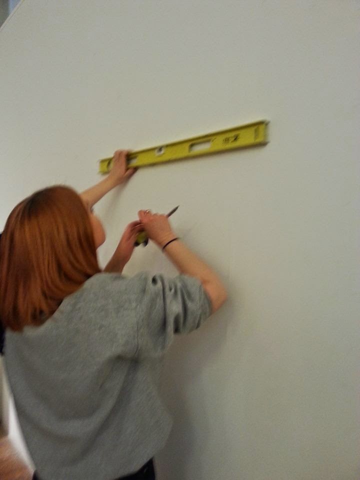
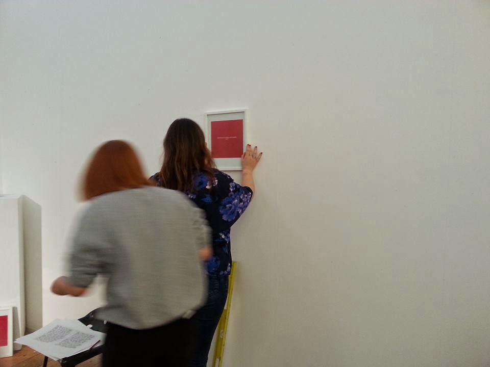
The other piece of artwork we decided to put up first was Jasmin khatuns, as the picture frames only had to be hung and we decided her sound piece would simply be displayed on a plinth by electrical sockets. Therefore, Rhian, Brogan and Suzie had to measure and hang the picture frames, of which covered plug socket holes in wall, so that the hole was not a distraction to the audience. We was going to have headphones next to the sound piece, however we decided that it would be more effective having the sound piece play out loud, as there wasn't any other sound to distract from it in the exhibition.
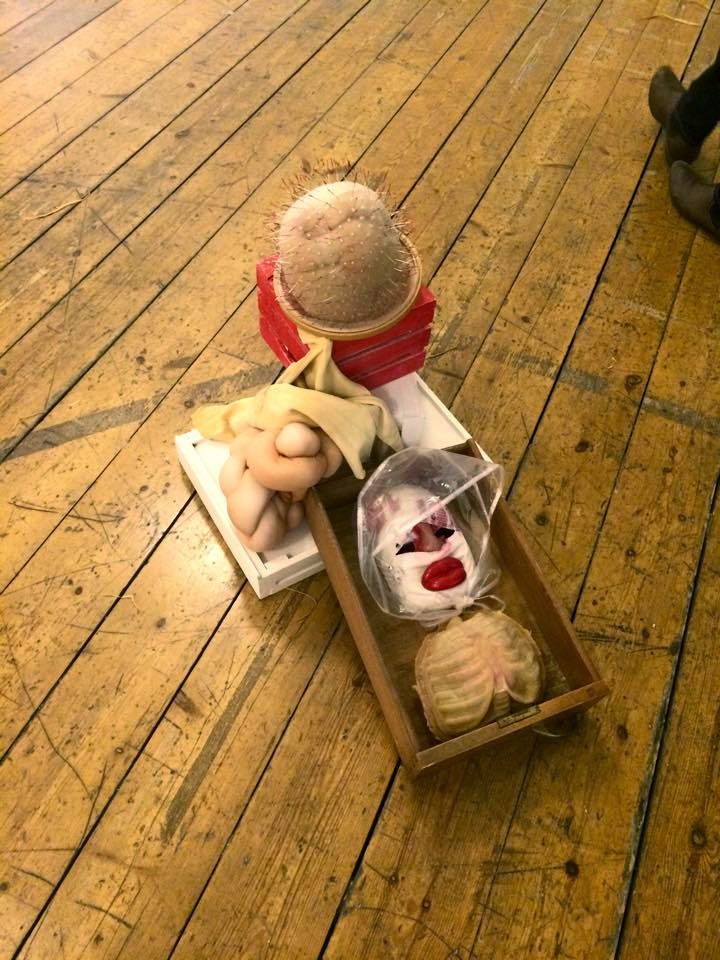
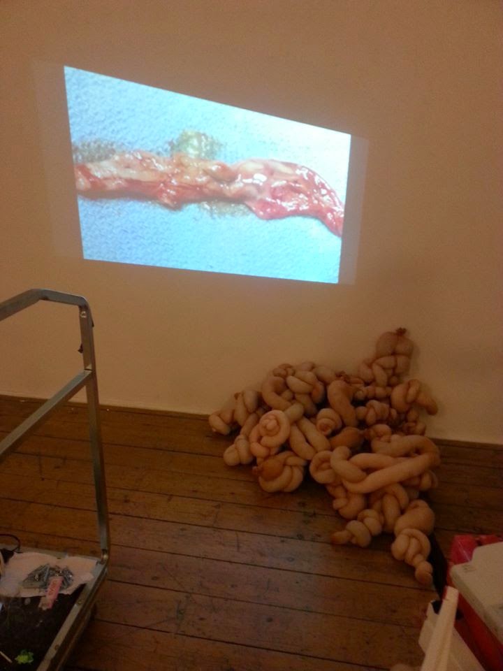 Originally we was going to display the projector on a plinth so that Shelley Hughes's projection clips were at eye height and straight on the wall. Setting up the projector was quite difficult, however Sarah was familiar with the technology after producing a video before. Once the projector had been sorted out and we understood how to use it, we developed the idea of having a more creative approach to using the projector in the exhibition. After speaking the Fran, we decided to use more of Shelley's work to do this. Shelley was kind enough to let us use work which we had not originally arranged with her and draws that she uses for her work in order to make a secure stand for the projector. After making the stand we then arranged for different works to surround the projector to disguise it as much as we can, whilst supporting the idea of what Shelley's work is about. After we had arranged this, we then decided that the piece which Shelley uses to project her clips onto, was not working in our exhibition. We decided to put the pieces piles up on the floor next to her projections as a supporting piece to the video. We then played around with the angle of the projection and decided we like the projection on an angle. As this was more interesting to view then a having a simple straight projection. After feeling inspired for curating Shelley's work with our own twist we decided to install and create our own piece using parts of work in the middle of the floor space, of which displayed an interesting light piece to match all the different lighting from the other pieces in the exhibition. We felt as though Shelley's work was the most disturbing to look at, representing our uncomfortable approach to viewers.
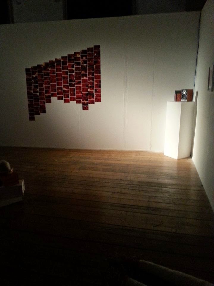 After Curating Shelley's piece we decided to get creative with presenting Anna Phillips photography piece by arranging in a way which reflects Shelley's on the opposite wall. This is because we felt that our exhibitions does not suit boring straight artworks and therefore we arranged the piece with a twist, again. As Hollie was sticking the photos to the wall we decided that we shouldn't stick all the photo's on as we like the unfinished look. It added a sense of curiosity, what pictures are missing? What does the artist not want the viewer to see, etc. The piece took up a lot of room on the wall, however due to use not having many wall pieces, we felt as if it used the space effectively.
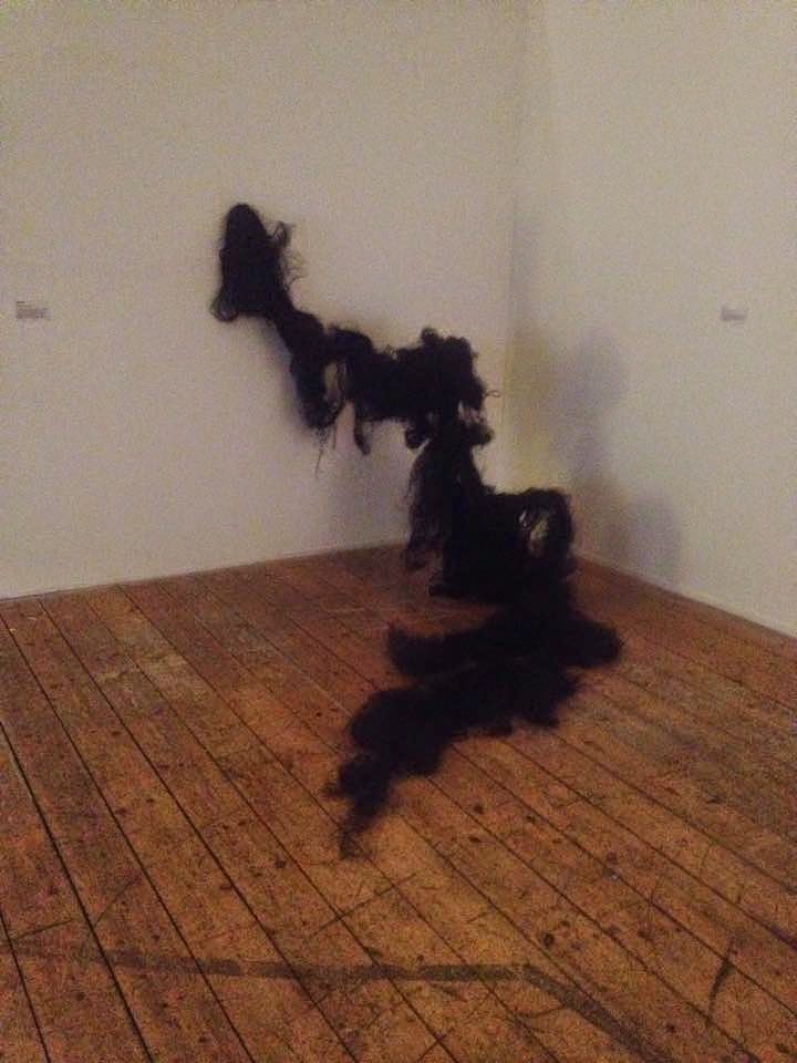
 Putting Bianca Marsland's hair pieces up was one of the most enjoyable pieces to put up, as the artist left it completely up to us of how we wanted to display it. Hollie and myself explored different ways of how to present it. However it was Hollie who come up with a floating idea, using fishing wire. We used the whole in the wall to hold the top of the hair and then decided we wanted to hair to coming into the center floor space. We believed this created a connection between the floors and the walls. Bianca's other hair piece was very easy to put up, as we always that we wanted the hanging hair in the entrance of the room to create that uncomfortable feel from the audience. Although we did have to add extra hair to the piece. We wanted the hair hanging down on an angel so that the viewer entered in a certain way, in order for them to avoid the hair. This enforced the idea that people naturally would not like to touch the hair.
 Ilona Sikita's work was one of the most difficult pieces to install, as although is a small wall piece, the artist has to spend half and our re-drawing the piece in the wire herself. This is why we could not try out different positions for the piece. The artists did not want the piece high or low as she was very sure about having it at high level. However due to the Ilona's lamp piece being at eye level we did not believe they would both work together at high level height. Therefore the artists agreed with having the piece high up on the wall. After this problem was solved the vaginal lamp piece was very easy to set up as it just needed to be plugged in on top of a plinth.
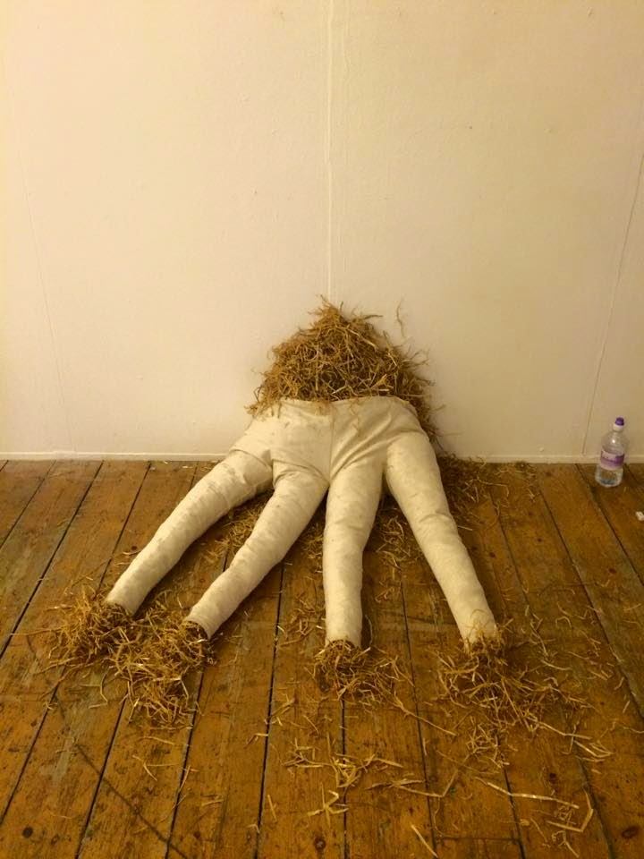
Yazmine Boyle's piece was the easiest piece to install, although we was unsure where to put the piece. Originally my idea was to have it lying flat in the center of the room as due to the space we could not hang the piece. However we decided to having it slouching up a wall. We felt as though this working for the exhibition, as like Bianca's hair piece, it involved the floor and walls together. After adding extra hay around the piece, we had finally finished the exhibition.
Refreshments were not put in the exhibition space, as we feel it de-values the event, so we put it in the entrance, out of the way.
The lighting in the room, was quite dark, as we chose not to have the lights on and the blinds were shut. However we could afford to this as 4 pieces in the room involved lighting and therefore it was more effective not having lights on in the exhibition.
The exhibition required a member of the group to turn on the electrical piece, such as the sound piece and projection in the morning of the exhibition days. As i was the only member of the group who was willing to do this, i went in early both mornings to do this.
Thursday, 26 February 2015
Final Meeting Before Exhibition
In the final meeting before the exhibition we needed to discuss that everyone had defiantly completed there parts in making the exhibition come together. The whole group was very happy with the progress from the previous group meeting and were re-assured that everything was going to plan. Personally i believe that we have all achieved our individual goals in order to make the exhibition come together as everything was completed from the leaflets to the rick assessment. All the equipment was booked and we were ready for the big set up. With only one day left we discussed refreshments and decided we would each bring in different food items and drinks for the opening night.
Friday, 20 February 2015
Group Meeting
As we were very close to the exhibition date, the group and I wanted to make sure everything was organised ready for the 25th. We had to make sure that everyone had arranged with there artists when we was collecting there work. Also we had to check over all the details such as the risk assessment, which would be completed on the day. The equipment had been booked out by Sarah and Kieran for three days and the advertisement documentation had been put up round the school previously for a week and a half.
We also need to discuss the budget for food an drink as we advertised refreshments on the private invite opening event. We each gave Hollie £2 for the wine and drink and decided that food would be purchased or made by everyone to bring in individually.
We also need to discuss the budget for food an drink as we advertised refreshments on the private invite opening event. We each gave Hollie £2 for the wine and drink and decided that food would be purchased or made by everyone to bring in individually.
Thursday, 19 February 2015
Hiring Equipment
Our exhibition needs to be thoroughly organized as there is a lot of equipment that's needs to be booked a few weeks before the exhibitions to be sure that it is available. We divided the equipment up into different sections, according to whether they need to be hired or brought.
Hired Equipment
Projector
Speakers
Extension lead
Safety plugs
Speakers
Ladders
Electric Drill
Plinths
Brought Equipment
Nails
Hammer
Blue tack
White tape
Hired Equipment
Projector
Speakers
Extension lead
Safety plugs
Speakers
Ladders
Electric Drill
Plinths
Brought Equipment
Nails
Hammer
Blue tack
White tape
Tuesday, 17 February 2015
Rooms Measurements
In order to plan the layout of the exhibition, we need to know the measurements of the exhibition space. Therefore Kieran put together a a floor measurement plan so we were aware of how many pieces can go on each wall and in the center of the room.
Locating Documents
In order to advertise our documents we located them around different areas of the art school, of which people will notice them most.

For example we located the private opening night invitations in the tutors piegan holes. As we are aware the tutors will definitely see them here.
 We also located some of the posters on the walls so people are face on with them when coming down the stairs. The posters were also advertised in places were lots information and events are.
 We advertised our flyers on tables as people can just pick one up if they are interested.
We feel as though where we located our advertising documents is quite important as if they are not located where people will see them, then there would be no point in creating them in the first place.

For example we located the private opening night invitations in the tutors piegan holes. As we are aware the tutors will definitely see them here.
 We also located some of the posters on the walls so people are face on with them when coming down the stairs. The posters were also advertised in places were lots information and events are.
 We advertised our flyers on tables as people can just pick one up if they are interested.
We feel as though where we located our advertising documents is quite important as if they are not located where people will see them, then there would be no point in creating them in the first place.
Monday, 16 February 2015
Facebook Event Page
The group and I though it would be a good idea to set up a Facebook event page, which is made public so people are aware that anyone can view the exhibition. The page allows people from everywhere to see where our exhibition is being held and get further details. On this page we can post our leaflets, invites etc so that an wider audience can see it. Our intention is to advertise our exhibition in a more modern way, as the using the internet keeps costs down.

The QR code on the invitations and leaflets, directly sends the public to our Facebook page, through an app called... We thought this would be a good idea to inform the public that we have a Facebook page with more information on, of which they can comment any questions and feedback concerning the exhibition.
Final Press Release
I didn't want to use loads of imagery as it gives too much of the exhibition away, so it doesn't leave the audience curios of what might be in the exhibition.
I put the slogan in red to make it stand out, and put it in the font 'chiller' as it makes the audience read the slogan in a way which is interesting and creepy reflecting in a positive way one the exhibition.
The text is in black and a formal font as i want to keep the formal idea of a press release even though i have wrote it in quite an informal way.
I have put the important information to the side of the text in a grey tone so it is still readable but does not distract the attention away from the advertising text.
Advice on Press release
I decided to use the our group Facebook page to gather advice on how to improve our press release, which im writing. Through doing this i save time rather then waiting for the next meeting to get advice. Everyone was very happy with the work i had produce so far and after a few critiques on what i had already done, i was able to finish our press release the same night. Using social media has become very handy for our group work as it allows us to communicate and post files which we would not be able to through text messages etc.
First attempt at Press Release
I chose the slogan 'Just when you thing you had seen it all' because its intriguing and leads the viewer to curiosity of 'what have they not seen or whats so different in this exhibition.
I wanted to keep the text short sweet a snappy so that the audience would not be put off by a big long winded text .
In the first paragraph i have discussed a bit on the background of the exhibition like the curators and then i have briefly mentioned the concept.
I have tried to keep the press release quite informal so that everyone feels welcome.
In the second paragraph i have mentioned the artist and some specific names. I also so mentioned some subject matters within the exhibition which i thought was the most interesting.
I have exaggerated on words, to appeal to the audience as a press release is meant to capture the audience's attention. Also false advertisement is illegal so it is important not to lie on a formal document. Therefore i have exaggerated the truth as much as possible without lying. such as the 'greatest artist yet to appear'.
In the third exhibition i have mention where the exhibition will be held and that refreshments will be hosted. Which again draws people's attentions in.
Finally at the bottom of the page i have put key info, such as address's, numbers, facebook page, dates and times.
Also it is important to mention whether the exhibition is free or not, as people might not come if the think the exhibition costs money.
Press Release Research
Lots of images, perhaps too much
Bold artist name and title of exhibition
2 page press release - unnecessary room
short and simple text - nice and easy too read- viewer wont be put off
Well structured pargraphs
Only mention key points
Mentions name of people in photographs
How many pieces are involved.
sponsors
quotes
captions under images.
Press Release Research
Gallery name at the top
Adress , numbers and other details are too the side.
Title of Exhibition and year date at the top.
Paragraphs are on the artists involved in the exhibtion.
Titles of the paragraphs
Dates for the different artists and works exhibited each month.
Text is straight to the point
No images
Text is a bit long winded, could be shorter
The length is op putting, it is not appealing to read.
very formal, does not seem to draw an audience in.
Press Release Research
Title at the top- and Gallery
Straight away i notice how long the text is - this is quite off putting
Talk about the background of the exhibition- its purpose etc.
The release is straight to the point no irrelevant sentences.
Mentions artist names.
Mentions a bit about the artists briefly.
Dates and time of exhibtions.
Mentions whethere work is for sale or not,
Title of the exhibition at the bottom.
No imagery. The press release is quite plain.
The adress and telephone number is at the bottom.
Well structured paragraphs to make it clear and what is being discussed.
Writing the Press Release
Due to my allocated Role in the Group being to right the Press Release i believe i should research published press release's in order to get the most effective press release i'm capable off. Research will also inspire me with ideas i hadn't though off.
Final Invitation Designs
Final Design Leaflet
Final Poster Design
Between Suzi and Rhian the designed the final design documents of ;
- Poster
- Invites
- Leaflets
Suzi produced the texts on the designs and Rhian created the imagery and titles.
finalising designs ideas
Rhian is in charge of creating the imagery for our designs, such as the leaflets, invitations and posters. We chose Rhian to create the final designs as she is the most advanced in digital design from what we had seen in her first design ideas. The images Rhian have used are original photographs of Bianca Marsland's hair pieces. We felt this was important to take pictures of the work rather then random images off the internet. I personally thought they were images of the internet until i recognized the colour's in blonde hair. Rhian was definitely the right choose for the job.
 |
| Poster designs |
 |
| Invites |
 |
| Invites |
Our Exhibition Display Stratagies
Our Exhibition Display Strategies.
Based on viewing the Midland Exhibition there are several questions we have considered;
Will we follow similar conventions as the exhibition?

 The conventions which will be similar are the way the 2D works are hung on the walls, such as the 1 meter difference and the height of eye level. Also for some of the sculptures they may be displayed on plinths. However the conventions we will not follow is the coloured walls as we would like the traditional white cube space. Also due to the space we have been given we will not be able to show the projections in a dark room, as the space has open windows, that do not block out the natural day light, so even if we turned of the lights it would still not be dark. We also want to try and get seating for our exhibition however this might be difficult due to the limited amount of space we have.
What is our vision, concept and layout we want?
So far we have decided that we want the work to be interactive with viewer so such things as the hanging hair that the audience have to walk under. We also want the concept to show through from the way we layout the work not just from the work we have chose. Due to the concept being about uncomfortableness we want the viewer to be almost shocked by every piece of work, which means there is no particular group layout with the overall exhibition theme.
Exhibition Research - West Midlands Open
After visiting the West Midlands Open Exhibition the group and i formed many ideas and knowledge on how to structure a successful exhibition.
We identified the 'conventions' of Display by;
 Therefore we can conclude that the 2D works relation to each other is that they are hung on the wall for the majority of the time. 3D works share the relation of being below eye height and mainly in glass boxes or on plinths. However some 3D work is hung walls if this is how the artist wants the work displayed.
We identified the 'conventions' of Display by;
- Identifying the way in which the art is displayed; photography, film etc.
2. Looked at how the 2D and 3D works relate.
 Therefore we can conclude that the 2D works relation to each other is that they are hung on the wall for the majority of the time. 3D works share the relation of being below eye height and mainly in glass boxes or on plinths. However some 3D work is hung walls if this is how the artist wants the work displayed.
3. Analysing all aspects of the hanging i.e height, spacing etc.
The artwork on the wall is hung by screws on either side hidden by the pieces. The works on the walls are all 1 meter apart as this is enough spacing for the viewer to be able to focus on one piece at a time and are hung at eye height.
4.evaluated the way in which the artworks were grouped together.
There is no definite way in which the artworks are group together as the works are exhibited to be sold. however my judgement would be that the works are grouped together depending on the sort of works people are looking to buy. for example portraiture, nature, abstract. Therefore everything the buyer would be interested in will be in the same area, like a shop is displayed. Also to differentiate the different groups of work there were different coloured walls which the work is displayed on. This makes it easier for the buyers to see the different sections of the exhibition. It also challenges the idea of displaying artwork in the white cube.
5. Evaluated the overall quality of the exhibition display.
Personally i believe the exhibition was a success for versatility of art works which people are interested in, so all types of people are attracted to the exhibition. However how the artworks are grouped is a little confusing, although i'm aware the art works are to be sold, not just to take pleasure in. Therefore i think it's fair to conclude that the exhibition was a success for its purpose, however it was simple and not something i would recommend.
Thursday, 12 February 2015
Exhibition floor plans
Although Brogan produced the floor plans, we didn't want to have a final floor plan until we had started to set up the exhibition. This is because we decided it was best to try out different ways of presenting the art works before having a definite layout.
 the first floor plans were quick drawings with colour symbols in order to get an idea of what we think the exhibition should look like. We had to consider things such as lighting and plug sockets as we have a lamp, sound piece and a projector all of which need to use electricity. We were aware that when planning the exhibition layout this would limit us. However the ideas Brogan has designed try out all different locations for the artworks to see what will be most effective. We were aware that Anna would need a lot of wall space, so we knew that she would have to have the of majority a wall to herself. The problem i think we faced was that a lot of our piece were sculptural and we were unsure what should be in the middle of the room. This is why we had to keep our options open. We were also very sure on having Bianca's hanging hair piece in the entrance of the room. Although it is important at this stage we need to consider where refreshments would go as we did not want this to interfere with artworks.

Our plan of action from seeing these floor plans is just to keep an open mind as we are sure that from experimenting with the different artworks in various positions we will decide on a final layout.

 the first floor plans were quick drawings with colour symbols in order to get an idea of what we think the exhibition should look like. We had to consider things such as lighting and plug sockets as we have a lamp, sound piece and a projector all of which need to use electricity. We were aware that when planning the exhibition layout this would limit us. However the ideas Brogan has designed try out all different locations for the artworks to see what will be most effective. We were aware that Anna would need a lot of wall space, so we knew that she would have to have the of majority a wall to herself. The problem i think we faced was that a lot of our piece were sculptural and we were unsure what should be in the middle of the room. This is why we had to keep our options open. We were also very sure on having Bianca's hanging hair piece in the entrance of the room. Although it is important at this stage we need to consider where refreshments would go as we did not want this to interfere with artworks.
Our plan of action from seeing these floor plans is just to keep an open mind as we are sure that from experimenting with the different artworks in various positions we will decide on a final layout.

Subscribe to:
Comments (Atom)


